Read: 14a - CSS Transforms, Transitions, and Animations
Transform

With CSS3 came new ways to position and alter elements. Now general layout techniques can be revisited with alternative ways to size, position, and change elements. All of these new techniques are made possible by the transform property.
Transform Syntax
The actual syntax for the transform property is quite simple, including the transform property followed by the value. The value specifies the transform type followed by a specific amount inside parentheses.
div { -webkit-transform: scale(1.5); -moz-transform: scale(1.5); -o-transform: scale(1.5); transform: scale(1.5); }
2D Transforms#two-dimensional-transforms
Elements may be distorted, or transformed, on both a two-dimensional plane or a three-dimensional plane. Two-dimensional transforms work on the x and y axes, known as horizontal and vertical axes. Three-dimensional transforms work on both the x and y axes, as well as the z axis. These three-dimensional transforms help define not only the length and width of an element, but also the depth. We’ll start by discussing how to transform elements on a two-dimensional plane, and then work our way into three-dimensional transforms.
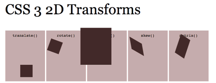
- 2D Rotate
- The transform property accepts a handful of different values. The rotate value provides the ability to rotate an element from 0 to 360 degrees. Using a positive value will rotate an element clockwise, and using a negative value will rotate the element counterclockwise. The default point of rotation is the center of the element, 50% 50%, both horizontally and vertically. Later we will discuss how you can change this default point of rotation.
- 2D Scale
- Using the scale value within the transform property allows you to change the appeared size of an element. The default scale value is 1, therefore any value between .99 and .01 makes an element appear smaller while any value greater than or equal to 1.01 makes an element appear larger.
- 2D Translate
- The translate value works a bit like that of relative positioning, pushing and pulling an element in different directions without interrupting the normal flow of the document. Using the translateX value will change the position of an element on the horizontal axis while using the translateY value will change the position of an element on the vertical axis.
- 2D Skew
- The last transform value in the group, skew, is used to distort elements on the horizontal axis, vertical axis, or both. The syntax is very similar to that of the scale and translate values. Using the skewX value distorts an element on the horizontal axis while the skewY value distorts an element on the vertical axis. To distort an element on both axes the skew value is used, declaring the x axis value first, followed by a comma, and then the y axis value.%p
Combining Transforms#combining-transforms
It is common for multiple transforms to be used at once, rotating and scaling the size of an element at the same time for example. In this event multiple transforms can be combined together. To combine transforms, list the transform values within the transform property one after the other without the use of commas.
Using multiple transform declarations will not work, as each declaration will overwrite the one above it. The behavior in that case would be the same as if you were to set the height of an element numerous times.
Transitions & Animations
One evolution with CSS3 was the ability to write behaviors for transitions and animations. Front end developers have been asking for the ability to design these interactions within HTML and CSS, without the use of JavaScript or Flash, for years. Now their wish has come true.
With CSS3 transitions you have the potential to alter the appearance and behavior of an element whenever a state change occurs, such as when it is hovered over, focused on, active, or targeted.
Transitions
As mentioned, for a transition to take place, an element must have a change in state, and different styles must be identified for each state. The easiest way for determining styles for different states is by using the :hover, :focus, :active, and :target pseudo-classes.
There are four transition related properties in total, including transition-property, transition-duration, transition-timing-function, and transition-delay. Not all of these are required to build a transition, with the first three are the most popular
Transitional Properties
It is important to note, not all properties may be transitioned, only properties that have an identifiable halfway point. Colors, font sizes, and the alike may be transitioned from one value to another as they have recognizable values in-between one another. The display property, for example, may not be transitioned as it does not have any midpoint. A handful of the more popular transitional properties include the following.
8 SIMPLE CSS3 TRANSITIONS THAT WILL WOW YOUR USERS
- Fade in
- Fade in effects are coded in two steps: first, you set the initial state; next, you set the change
- Change color
- Animating a change of color used to be unbelievably complex, with all kinds of math involved in calculating separate RGB values and then recombining them
- Grow & Shrink
- To grow an element, you used to have to use its width and height, or its padding. But now we can use CSS3’s transform to enlarge.
- Rotate elements
- CSS transforms have a number of different uses, and one of the best is transforming the rotation of an element
- Square to circle
- A really popular effect at the moment is transitioning a square element into a round one, and vice versa. With CSS, it’s a simple effect to achieve, we just transition the border-radius property.
- 3D shadow
- 3D shadows were frowned upon for a year or so, because they weren’t seen as compatible with flat design, which is of course nonsense, they work fantastically well to give a user feedback on their interactions and work with flat, or fake 3D interfaces.
- Swing
- Not all elements use the transition property. We can also create highly complex animations using @keyframes, animation and animation-iteration.
- Inset border
- One of the hottest button styles right now is the ghost button; a button with no background and a heavy border. We can of course add a border to an element simply, but that will change the element’s position. We could fix that problem using box sizing, but a far simpler solution is the transition in a border using an inset box shadow.